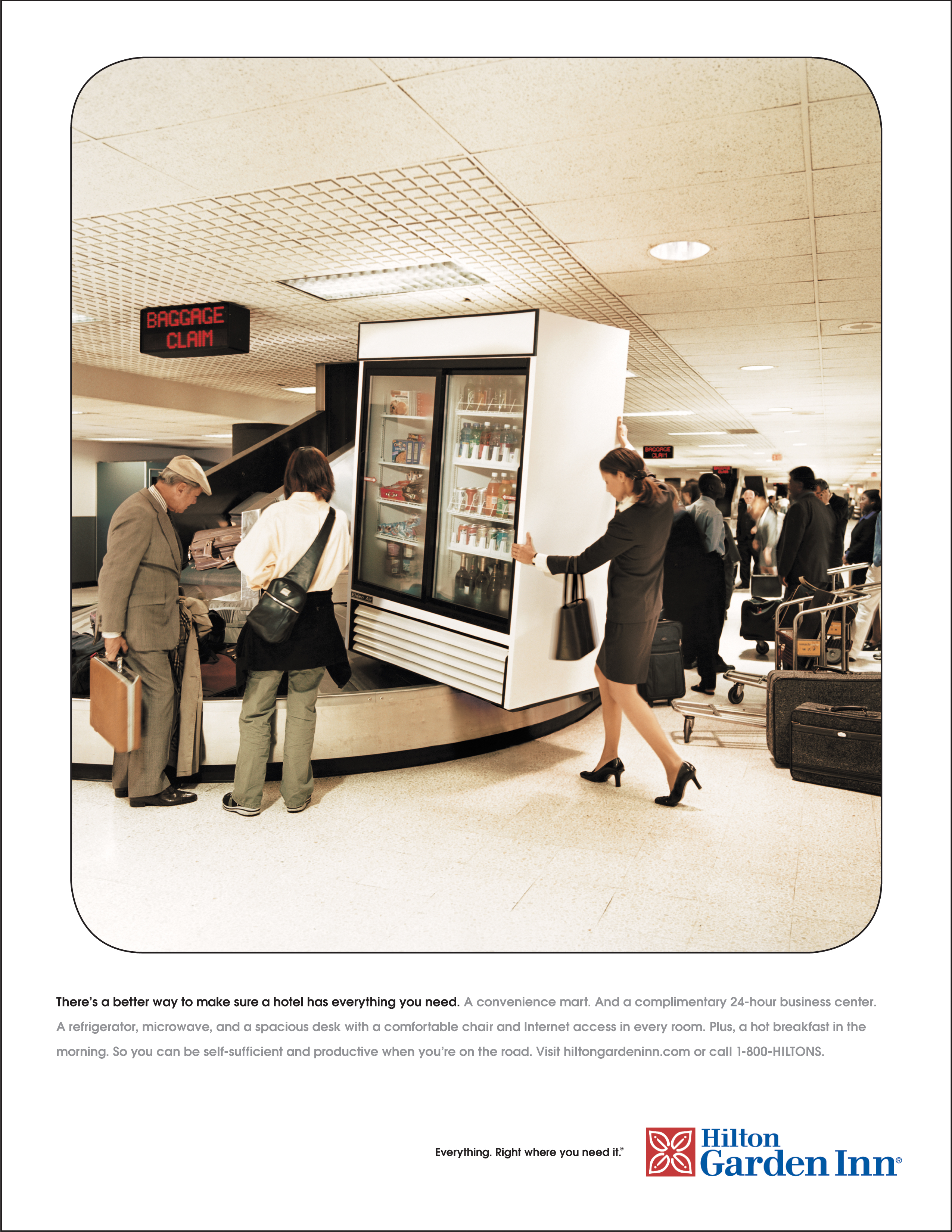
It was a fresh concept at the time. A whole brand that, instead of trying to be all things to all people, was specifically designed to cater to self-sufficient travelers who demand high-quality comfort, but don’t want or need to be doted on. In other words, mostly business travelers who want a clean, modern, unfussy Hilton-class hotel with everything they need —and nothing they don’t.